
Color Wheel Activity:
Discovering Primary/Secondary Colors, Warm/Cool Colors, and their Complements
Materials: (Enough for class)
Paper
Compass
Ruler
Pencil
Red, Blue, Yellow paints or colored pencils
This lesson will introduce the students to the basics of color theory, as well as the ways in which artists use color to guide the viewer’s attention through a paintings composition. This activity will require students to create a color wheel and label the primary and secondary colors and warm and cool colors and how they compliment each other. Note: This lesson will take about two class periods in intervals of 45-60 minutes
Note for teachers: The primary colors are yellow, blue, and red. Secondary colors are made by mixing the primary colors: red + yellow = orange, blue + red = purple, and yellow + blue = green. Complementary colors are opposite of each other on the color wheel and can create a contrasting tone when used with each other. Complementary pairs include yellow and purple, blue and orange, and green and red.
To begin:
The instructor will have the students
1. Cut out a 10 in in diameter circle using the compass and pencil and divide the circle into six equal “pie” parts.
2. Label the six pieces 1-6.
3. Color sections 1, 2, and 3 with the blue paint or pencil. Fill in spaces 3, 4, and 5 with the red and then 5, 6, and 1 with the yellow. Space 1 should become green, 3 becomes purple, and 5 becomes orange. 2, 4, and 6 should remain their primary color.
4. Have the students label the colors as primary and secondary (explained in teacher notes). Then have them identify and label the complimentary colors with a connecting line between the colors. If needed, the teacher can allow the students to experiment with complementary colors by placing them side by side on a scrap sheet of paper.
5. The students should now be able to differentiate between the primary and secondary colors as well as identify which colors are complimentary. This color wheel will be a necessary tool for the next exercises.
The teacher will then present a painting:
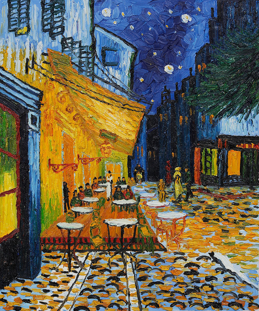
Pt. 1: Cafe Terrace at Night - Van Gogh (This is a link)
Identifying Color and Their Complements
The students will view this painting and using the color wheel they made, they will identify the primary and secondary colors throughout it as well as how these colors complement each other. Complementary colors are pairs of color that are opposite each other on the color wheel. The two colors in a pair of complementary colors are highly contrasting and create an aesthetically pleasing color palette or can make a person feel anxious and uneasy. This will help show students that artists make many choices with color to help draw the viewer’s eye to important details, visuals, and figures in an image.
For the teacher: Begin by asking the students to identify primary and secondary colors and any complementary pairs in the Van Gogh painting using their color wheel.
Then present the students with these questions:
1. What are your eyes drawn to first? Why?
A: My eyes are drawn to the orange glow of the cafe terrace. That is because it is the most vibrant color and it directly contrasts with the blue that is pretty much in the rest of the painting.
2.Why do you think the artist chose these colors in their piece?
A: Because it draws the viewers eye directly to the focal point, which is the cafe terrace. If the terrace was not such a vibrant orange, the painting would not have the same feel that it has. My eye would also not be so drawn to the focal point if the orange was replaced with red or green or something because there would then be no contrast in colors, making the focal point fall back into the background.
Pt. 2: Identifying Warm and Cool Colors:
Warm and cool colors in a painting can create different atmospheric effects, including the illusion of depth. They can also give off emotion: the blues and greens can give a soothing, calming effect while reds and oranges can create a very energetic, warm piece. The students will also learn that cool colors recede into the background, while the warm colors “pop out” to our eyes, which is how artists achieve depth and volume in their work.
For the teacher: Begin by asking the students to use their color wheel and identify the warm and cool colors in the painting.
Then present the students with these questions:
3. Where are most of the warm and cool colors found in the space of the painting? (background, middleground, foreground)? Why do you think they were placed there?
A: Most of the warm colors are found in the foreground and mixed in with some cool colors in the middleground. Most of the cool colors are found in the background. They were placed there is that the foreground would pop out in comparison to the background and middleground. Foregrounds can be lost due to poor color palette.
4. Does this color placement have an impact on whether or not objects feel close or far away?
A: Yes, note the cobblestone floor in the front of the painting that extends to the right. The building right above it with the yellow windows stand out immensely in comparison to the blue buildings that extend to the back of the painting. They range from light blue to a very dark, almost black-blue. The black-blue building feels the farthest away in comparison to the building in the front of the row with the yellow window because the yellow pops out to my eye first before I ever even notice the building in the very back.
5. How else does color influence your eye on the piece?
A: Color can be a “guiding factor” in moving your eye throughout a piece. In Van Gogh’s “Cafe Terrace at Night,” the yellow and orange is used in certain spots purposefully throughout the piece to help guide the viewer’s eye around the piece and keep it stuck in rotation. If the eye is first drawn to the cafe terrace (the foreground), it will then move along the cobblestone path to the right side of the painting with the blue buildings with yellow windows. These yellow windows extend to the “back” of the painting which then lead you up to the stars and back to the terrace or just directly back to the terrace. Your eye creates a circular movement following the warm colors.
Paper
Compass
Ruler
Pencil
Red, Blue, Yellow paints or colored pencils
This lesson will introduce the students to the basics of color theory, as well as the ways in which artists use color to guide the viewer’s attention through a paintings composition. This activity will require students to create a color wheel and label the primary and secondary colors and warm and cool colors and how they compliment each other. Note: This lesson will take about two class periods in intervals of 45-60 minutes
Note for teachers: The primary colors are yellow, blue, and red. Secondary colors are made by mixing the primary colors: red + yellow = orange, blue + red = purple, and yellow + blue = green. Complementary colors are opposite of each other on the color wheel and can create a contrasting tone when used with each other. Complementary pairs include yellow and purple, blue and orange, and green and red.
To begin:
The instructor will have the students
1. Cut out a 10 in in diameter circle using the compass and pencil and divide the circle into six equal “pie” parts.
2. Label the six pieces 1-6.
3. Color sections 1, 2, and 3 with the blue paint or pencil. Fill in spaces 3, 4, and 5 with the red and then 5, 6, and 1 with the yellow. Space 1 should become green, 3 becomes purple, and 5 becomes orange. 2, 4, and 6 should remain their primary color.
4. Have the students label the colors as primary and secondary (explained in teacher notes). Then have them identify and label the complimentary colors with a connecting line between the colors. If needed, the teacher can allow the students to experiment with complementary colors by placing them side by side on a scrap sheet of paper.
5. The students should now be able to differentiate between the primary and secondary colors as well as identify which colors are complimentary. This color wheel will be a necessary tool for the next exercises.
The teacher will then present a painting:
Pt. 1: Cafe Terrace at Night - Van Gogh (This is a link)
Identifying Color and Their Complements
The students will view this painting and using the color wheel they made, they will identify the primary and secondary colors throughout it as well as how these colors complement each other. Complementary colors are pairs of color that are opposite each other on the color wheel. The two colors in a pair of complementary colors are highly contrasting and create an aesthetically pleasing color palette or can make a person feel anxious and uneasy. This will help show students that artists make many choices with color to help draw the viewer’s eye to important details, visuals, and figures in an image.
For the teacher: Begin by asking the students to identify primary and secondary colors and any complementary pairs in the Van Gogh painting using their color wheel.
Then present the students with these questions:
1. What are your eyes drawn to first? Why?
A: My eyes are drawn to the orange glow of the cafe terrace. That is because it is the most vibrant color and it directly contrasts with the blue that is pretty much in the rest of the painting.
2.Why do you think the artist chose these colors in their piece?
A: Because it draws the viewers eye directly to the focal point, which is the cafe terrace. If the terrace was not such a vibrant orange, the painting would not have the same feel that it has. My eye would also not be so drawn to the focal point if the orange was replaced with red or green or something because there would then be no contrast in colors, making the focal point fall back into the background.
Pt. 2: Identifying Warm and Cool Colors:
Warm and cool colors in a painting can create different atmospheric effects, including the illusion of depth. They can also give off emotion: the blues and greens can give a soothing, calming effect while reds and oranges can create a very energetic, warm piece. The students will also learn that cool colors recede into the background, while the warm colors “pop out” to our eyes, which is how artists achieve depth and volume in their work.
For the teacher: Begin by asking the students to use their color wheel and identify the warm and cool colors in the painting.
Then present the students with these questions:
3. Where are most of the warm and cool colors found in the space of the painting? (background, middleground, foreground)? Why do you think they were placed there?
A: Most of the warm colors are found in the foreground and mixed in with some cool colors in the middleground. Most of the cool colors are found in the background. They were placed there is that the foreground would pop out in comparison to the background and middleground. Foregrounds can be lost due to poor color palette.
4. Does this color placement have an impact on whether or not objects feel close or far away?
A: Yes, note the cobblestone floor in the front of the painting that extends to the right. The building right above it with the yellow windows stand out immensely in comparison to the blue buildings that extend to the back of the painting. They range from light blue to a very dark, almost black-blue. The black-blue building feels the farthest away in comparison to the building in the front of the row with the yellow window because the yellow pops out to my eye first before I ever even notice the building in the very back.
5. How else does color influence your eye on the piece?
A: Color can be a “guiding factor” in moving your eye throughout a piece. In Van Gogh’s “Cafe Terrace at Night,” the yellow and orange is used in certain spots purposefully throughout the piece to help guide the viewer’s eye around the piece and keep it stuck in rotation. If the eye is first drawn to the cafe terrace (the foreground), it will then move along the cobblestone path to the right side of the painting with the blue buildings with yellow windows. These yellow windows extend to the “back” of the painting which then lead you up to the stars and back to the terrace or just directly back to the terrace. Your eye creates a circular movement following the warm colors.
